 Sexy may not be the feeling that the word ‘infrastructure’ inspires in most of us, however, many are hoping that perception changes. In a hurry.
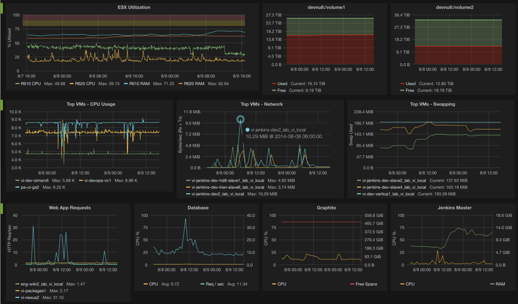
Infrastructure is key to what makes the INTERNET as captivating as it is. In this context, the context of technology, most companies (especially small and medium-sized business) think of it only when it is too late. Those who excel in their respective industry and meet and/or exceed their clients’ expectations do not. It is the hidden machinery behind fast loading videos on YouTube, snappy snaps loading up lickety split on Instagram. This is made possible by scalable, resilient, load balancing, fault tolerant, highly available infrastructure behind-the-scenes of every single click or touch on every single device in the world.
In another context, infrastructure is likewise key to maintaining safe, efficient, people-friendly cities, services and experiences. If we wish to do anything sexy, in reality as in business on the Internet, we cannot do it without infrastructure. It is the hidden machinery behind the sexy, more visible components of real life, including, but not limited to: transportation, education, entertainment, commerce, communication, each and every kind of goods and services requires it in order to deliver the sorts of experiences the first world expects.
Imagine living in a remote village deep in South America or an obscure neighborhood in an African nation with little or no infrastructure. Life is completely different in the first world BECAUSE of infrastructure. When we step up to the sink and turn on the tap, we don’t HOPE water will come out, we EXPECT that it will. The internet is the same way. We treat it like a utility in the same way we do water. That is likely why it is easy for us to take it for granted and even outright neglect it. The Web, for example, requires MASSIVE infrastructure in order to scale and meet the demands of everyone expecting to take a “drink.”
Lesser thought-of contexts of infrastructure include water treatment facilities, electrical grid, roads and maintenance of related systems that rarely command the urgency that some of the more highly visible and/or publicized components, such as school funding or policing, typically do. Unfortunately, this sort of neglect has very real consequences: in the US, an aging transit system, its roads, gas lines and other vital structures are falling into disrepair and the bills to fix them keep growing beyond city, county, state and national budgets.
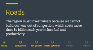
Here in Chicago, for example, the Chicago Metropolitan Agency for Planning (CMAP) attempted to work against such disinterest using great UX and Web design. CMAP’s new mobility-themed website uses data visualization to make major economic issues like congestion, antiquated freight systems and transit funding woes a little sexier — and a lot more urgent to voters and lawmakers. In other words, they worked hard and in thoughtful and intentional ways to illustrate in a friendly way how sexy infrastructure is and how it is responsible for the success (and arguably – happiness) of a huge, cosmopolitan region.
 Rather than focusing on charts and graphs, the site tells a story, starting with a swirling satellite map of the region, overlaid by the city grid. Only one statistic is visible: the miles of road and rail built in and around the Greater Chicagoland area. As users click around, they’re taken through several slides that briefly explain why infrastructure matters to Chicago’s economy and well-being, which sets up a set of data visualizations organized around roads, transit and freight infrastructure. One map presents color-coded interpretations of highway traffic, showing the average speed of traffic flow on major roads on weekdays. Another visualizes access to transit based on proximity, walkable distance and frequency, clearly illustrated by colorful grids.
In the end, the site makes a case for long overdue improvements but it achieves something even greater. It educates by opening channels to deep insights about complicated things. It does this not by forcing anyone to dig into the nuts and bolts of legislation or technical planning guides. No one is going to read a 300 page PDF about this stuff. If the goal is informing stakeholders, there is only one way to accomplish that – in relevant, elegant (and arguably – fun) bite-sized chunks. The site is successful in that it educates by creating an atmosphere that incentivizes learning through visual design. It’s just – cool – to click around in this stuff. In doing so, we can’t help but learn a thing or two we didn’t know before. THAT is great design!
The site is designed to appeal to both legislators, who make decisions about infrastructure funding, and also the average bear (citizen), who has probably never thought about infrastructure before, or all the planning and resources that go into them behind-the-scenes. To appeal to the legislators, designers highlighted economic aspects of infrastructure decay, like the 50-year cost of constructing expressways or the $20 billion needed to keep the regional transit system running. For the general audience, though, the billions of dollars in funding for capital projects is pretty abstract and tough to connect with in concrete ways. Designers addressed this challenge by relating abstract numbers to more tangible things, like the time people spend stuck in traffic or how much every single car passing over a bridge costs the region in maintenance. In short, they considered their audience. This isn’t just educating the culture at large about the necessity of good infrastructure, it’s just good UX.
The story’s takeaway? It’s definitely not a sexy topic to talk about and it’s definitely not something that people want to spend money on but, if you want to stay competitive, you have to build and maintain infrastructures that scale.
Businesses make the same mistakes. They don’t know what they don’t know and often learn too late that failing to plan and design infrastructures built for the short and long term is not a nice-to-have. It is essential to success. Neglecting to do so is costly on many levels. Now, while no design is perfect, that’s not the point here. The point is that when we fail to plan ahead, it always costs more. It is more cost effective to design and build infrastructures that enable us to efficiently and effectively handle current demands but, perhaps more importantly, build them to be able to scale to meet future ones.
Honestly, this degree of planning is extremely detail-oriented and tedious, maybe even boring. It is hard work to plan and implement infrastructure of most any kind. That’s what makes this example so unique. Taking information essential to the core of the goal and pulling meaning from it, stories relevant to the audience, makes projects like this far more successful not only for accomplishing scalable systems built to hold their value into the future, but arguably even more so for educating and enlightening a large audience, empowering everyone to understand perhaps just a bit more clearly the hidden machinery behind the things most of us take for granted.